
Don’t Call it a Comeback: The (Re)emergence of Illustrated Branding
Branding and design go through cyclical trends just like anything else. We’ve seen our fair share—equivalents of the puka shell necklace, “mall bangs,” and bellbottoms. When I was in the early days of my career, we were welcoming the rise of minimalism after the MySpace era (think sparkling marquees and tiled, animated GIFs in the background of your site). Embracing the almighty Grid ( 🙌 ) was as good as Sunday service for even the budding designer such as myself circa 2009.
Before we can talk about where we’re at, it’s worth touching on where we’ve been and how we got there. Graphic design is much like its fashion and interior cousins. Yes, it’s adornment, but its function is primarily, well, function. Design asks, “How can I best serve the people?” Knowing this fundamental truth is key to understanding how and why design will always mirror the human experience, popular culture, and technology. You can look throughout history and watch as design trends closely followed the needs and interests of the masses. Take, for example, the rise of DIY art and aesthetics every time technology births more accessible tools like the Xerox machine and zines, the camera phone and self-taught photographers, Canva and Instagram and self-made marketers. Or how a global pandemic and civil unrest are breeding more empathetic and compassionate brands. Design is both an expression and a response.
Minimalist design was a well-deserved palate cleanser from a long season of anything but minimal. Now that the pendulum is swinging back to maximalism, we’re seeing a rise in adornments: patterns, complex palettes, decorative typography and a blending of typographic styles, and illustration. I see this happening for a few reasons: first, there’s a return to the prioritization of the maker/artisan. The accessibility of technology is advancing at a steep trajectory making creative tools like CreativeCloud, ProCreate, Canva available to the masses. And I believe that culturally we are in a highly emotive and romantic era. We’re dusting off old trends, blending them to get something brand new. And we’re integrating more illustration at a volume that hasn’t been seen since photography largely took its place decades ago.
So, what is illustrated branding? They don’t necessarily have defined boundaries, so it’s a bit of a “you know it when you see it” scenario. You can count on them to check off a few boxes: their brand heavily or solely prioritizes illustrations as part of their visual language. There’s likely a system of illustrations that all fit the theme or concept of the brand. And, finally, it goes beyond simply including an illustration in your repertoire, this artwork is strategically tailored to fit, function, and represent the brand just like your other brand elements.
Illustrated branding offers us many new perks, so let’s touch on those:
Brand illustrations set the tone.
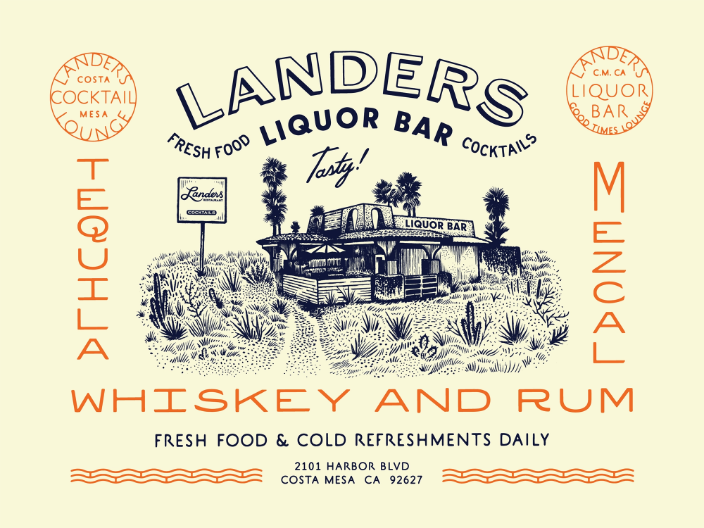
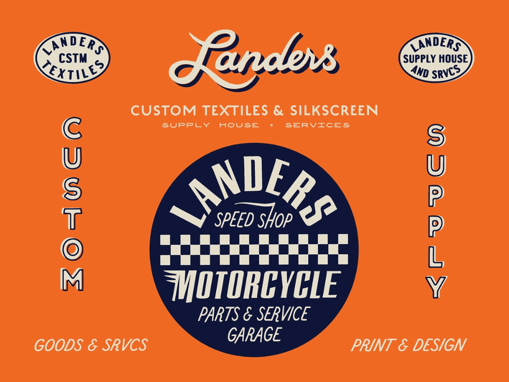
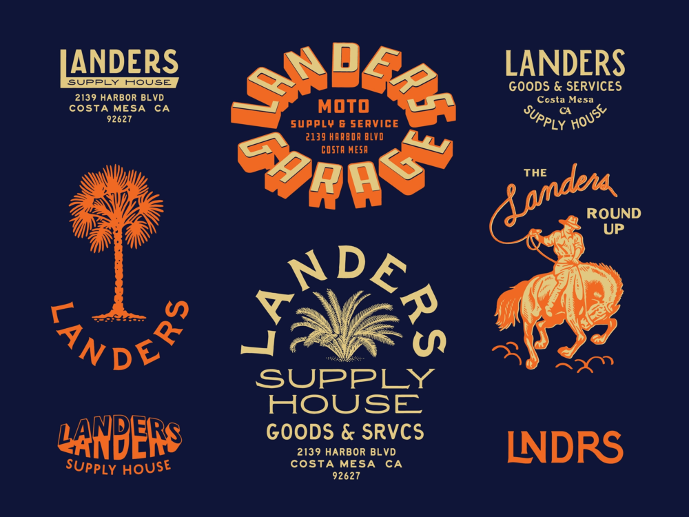
Well-designed and integrated illustrations succinctly build upon your concept and set the stage for how you want your brand to be perceived. Illustrations and similar visual elements cue the audience to what they can expect from you. In the case study above, Jonathon Schubert has expertly branded Lander’s Liquor Bar, a southern California watering hole. Illustrated elements like the palm trees, cowboy, checkerboard, flora, and fauna, tell me that Lander’s is likely a classically-inspired but laid-back hangout spot. They pay homage to 70s skate and moto culture with that quintessential So-Cal influence.
Case Study: Jonathan Schubert, The Schubert Studio | Landers Liquor Bar (Dribbble)
They offer you something completely unique and tailor-fit.
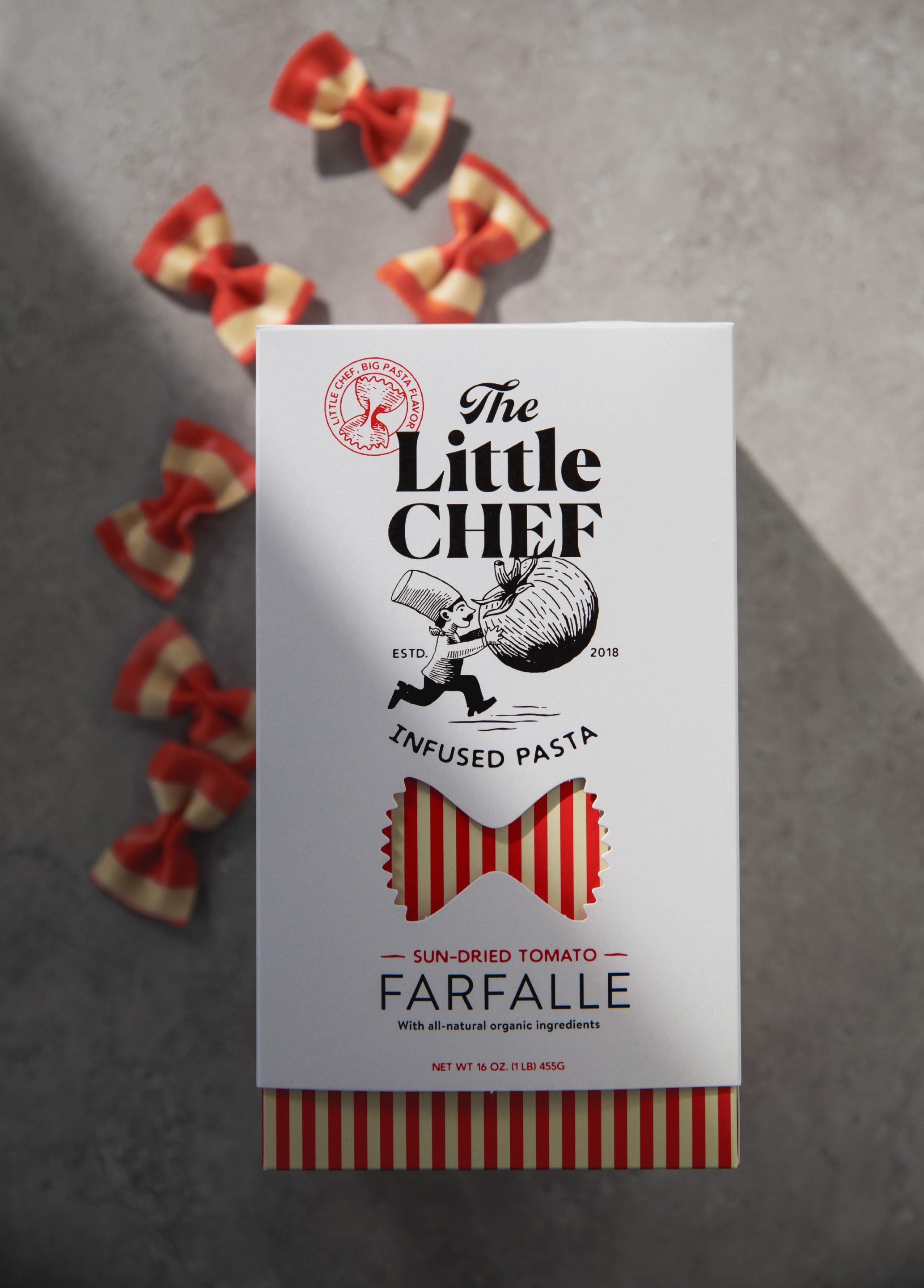
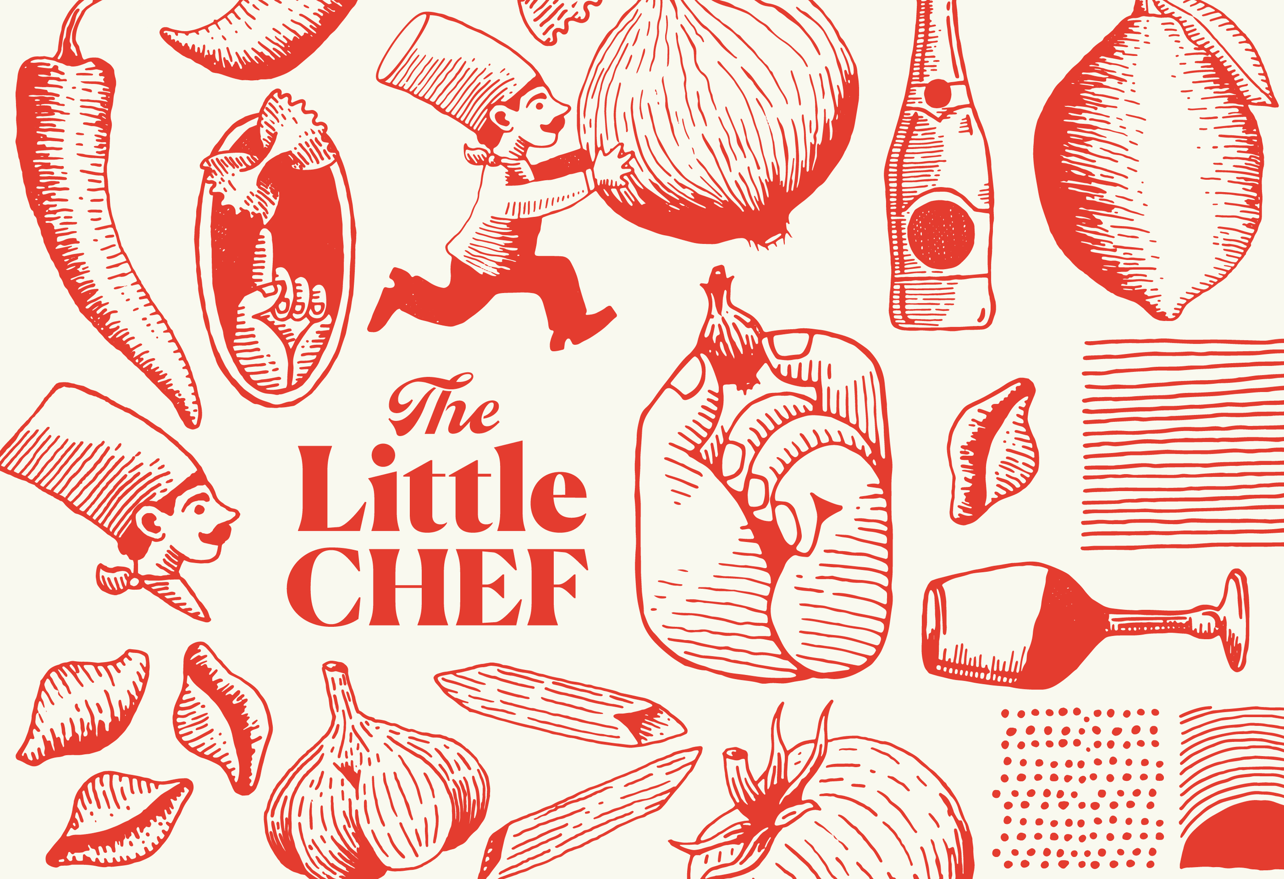
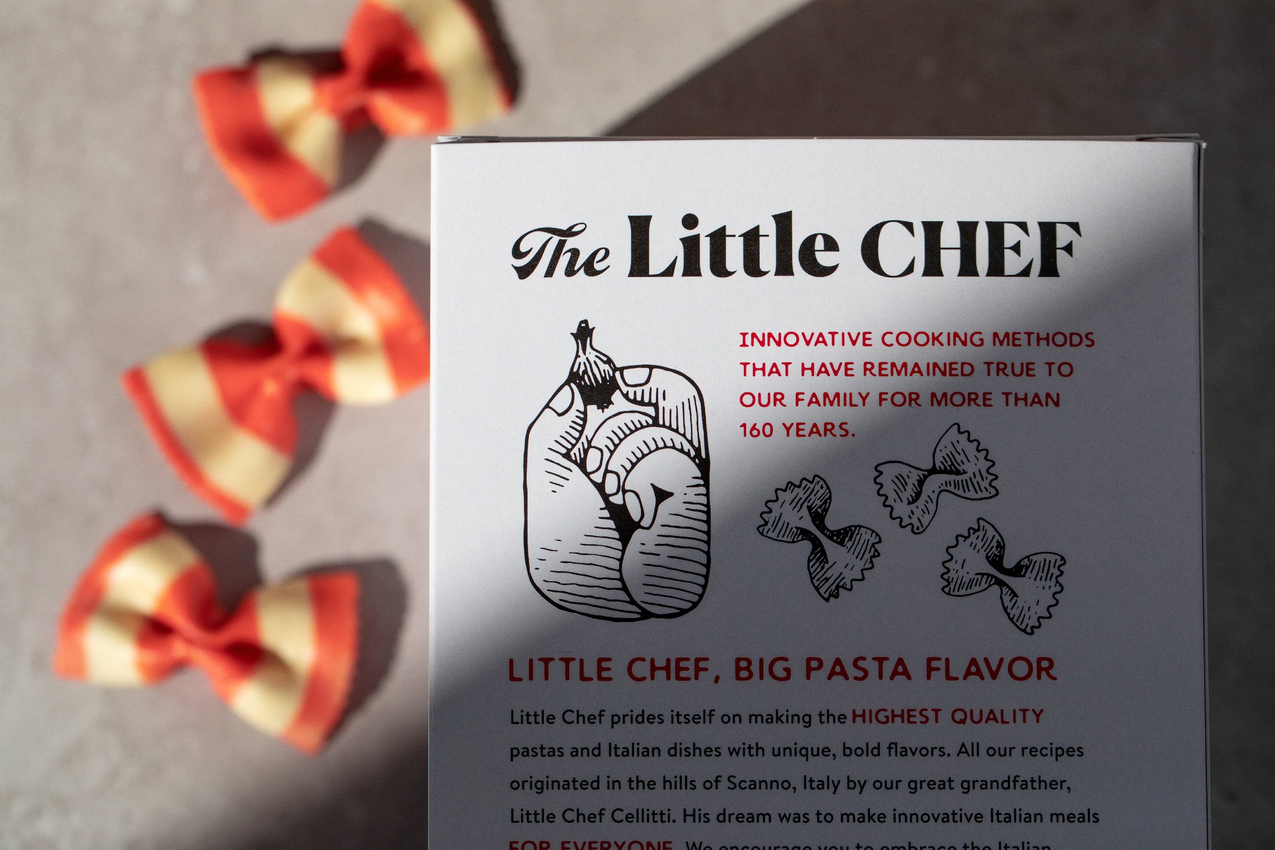
While I stand by the statement that it’s all been done before, there are plenty of ways to bring a fresh perspective to your industry, product, experience, or service. Every brand is like a recipe: we may all share many of the same ingredients, but it’s which ingredients you use, how you mix them, and your own background and influence that creates something truly your own. Illustration offers another label off uniqueness as you consider the concept, style, and usage. Tad Carpenter of Carpenter Collective created a spectacularly unique pasta brand design by utilizing several illustrative elements: the primary and secondary logos, the system of illustrations, and a few well-placed die-cuts in the packaging. The artwork is used to accent the branding as spot illustrations and patterns, serve as marketing elements, and give a whimsical quality to what could otherwise be perceived as simply another box of noodles on a shelf.
Case Study: Tad Carpenter, Carpenter Collective | The Little Chef (CarpenterCollective.com)
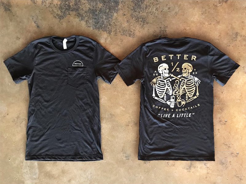
Brand illustrations give you more to work with.
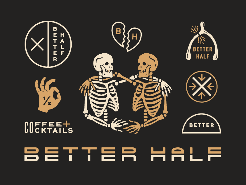
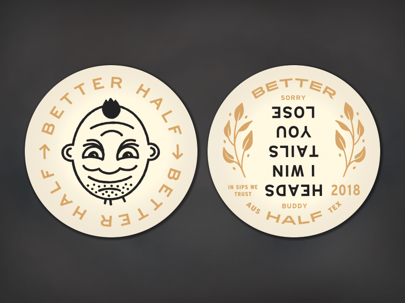
A great brand should come with a great supply of tools. A system of resources like photos, fonts, and illustrations offers you flexibility and sustainability so your brand can adapt as times and needs change. Illustrations are a unique way to add both form and function to your toolkit. You can use them on traditional brand materials, in online marketing, signage, and the full range of merchandise. Lauren Dickens work for Better Half Bar remains one of my favorite brands of all time. The artwork is functional, attractive, clever, and humorous. The brand has a tongue-in-cheek witty edge to it that more than carries to the physical location in Austin, TX.
Case Study: Lauren Dickens | Better Half Bar (LaurenDickens.com)
And they give you more to connect with.
More often than not, illustrations serve as both form and function by giving the audience something to connect with. Whether it’s pulling from something nostalgic that reminds people of a place or time, or it sets the tone with humor and whit, illustrations offer strategic influence when it comes to building meaningful bonds.
So, while illustrated brands are hardly anything new, I hope the pendulum stays awhile in our neck of the woods.
Honorable Mentions
Alana Louise | Figure 8 Coffee Purveyors (Alana-Louise.com)

Jay Fletcher | Chubby Fish (JFletcherDesign.com)

Land | Hochstadter’s Slow & Low (WorkByLand.com)

